So
often with Design, we are the first seen aspect of news presentation on a
particular story. In this respect, we are charged with setting the tone
of the piece. If a package begins with a live read, then what we
show will describe that which follows.
We
have a duty of care to get this right, whether the treatment describes the fun
nature of the story, or the serious connotations behind the facts. Get it
right and everyone benefits; get it wrong and not only are we open to ridicule,
but we risk misinforming or alienating the viewer.

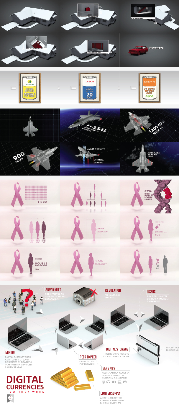
The
UFO intro was spot on. Quirky, fun, irreverent, but still relevant to the
subject and communicating the information. It panders to the viewer as
a target market to just the right degree.

Petrol
prices really benefitted the story. The nod to a retro feel played to the
historical nature of the facts; the treatment was simple (clean, clear, crisp, confident
design) and the communication did not suffer from any design ego.

Loved
the Spying Row design. Without going too far, there's something of the
Harry Palmer about the design. With spying in this context, we can
get absorbed in the tech and lose sight of the story. This got
the spying aspect spot on.
Let's
be clear on the difference between setting the tone and selecting a relevant
premise:

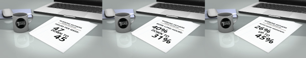
For
the Online Child Abuse story, we generated a set up which was wholly pertinent:
representations of images, facts and figures on a laptop. There's some
real cleverness in the animation (the status bar) and the information is
clear. There are some legibility issues with icons, but this isn't the
real problem.
The
problem, is that tonally, it doesn't feel right for the subject. The
treatment would feel equally at home in a story about BT as an ISP and
this does nothing to aid communication of the subject. Bluntly, it's
a little 'happy'.
As
mentioned in previous weeks, we must be careful not to over editorialise with
our treatment, but we should ensure that the 'look' is firmly in
the
right arena; in this case we need to represent criminal, sordid, sinister.
See the frame below as an example of what could be achieved to fix this – even after the fact and without a significant rebuild. It is an area where we can certainly raise the bar.

CDE
C.