but when pressure dictates delivery, we should be even more mindful that poor work is avoided.
We must not shy away from criticism of work which is unacceptable, rather attack the product, not the individuals, with a view to education and improvement.
So what's wrong here?
Road sign
As soon as the hospital icon is removed, you lose the context and are left with the question: why are hospital stats displayed on a road sign?
Hospitals have an enviable array of signage and iconography which could have been used to better effect
Too much information
The first animate has way too much info; its confusing. In the script this is broken down into two distinct parts. A separate animate should have been used.
Look at the story you're trying to tell. 313,000 patients waited 4+ hours : 5.9% of patients waited 4+ hours : 313,000 = 5.9% of patients
There are much better ways of visualising this.
As a minor point, it should be 4+ hours, not 4 hours +
Information badly broken down
Two animates on one page, followed by another animate directly related to the same context. We need to be more consistent.
Information which tells the story incorrectly
June 11 – 5% of patients shouldn't wait more than 4 hours
This says that 95% of patients should wait more than 4 hours, which is incorrect.
Much better to say Less than 5% of patients should wait more than 4 hours or
Target 95% of patients to wait less than 4 hours
Add to all of this a messy background, mismatched perspective and conflicting text angles and we are left with a confusing and misleading graphic which should never have gone to air.
Thankfully this was ultimately fixed and whilst the replacement is not perfect, it shows thought, consideration, style and clarity which we should have aimed for in the first place.
The clip is attached.
From both sides of visual output, we should never be afraid to question the products we believe do not work.
…
DESIGN EXCELLENCE AWARDS
These are the nominations for this months awards
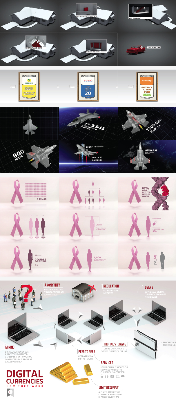
Some excellent work, plenty of variety and visual relevance and a first entry for the iPad. Why not comment on your favourite.
Celebrate Design Excellence
Chyaz


No comments:
Post a Comment